GROUND — layer 3 of seven
When the Ground Is Not White
Explains why painters have historically toned their grounds warm ochre, grey or mid-green, and how the ground colour bleeds through to the finished surface.
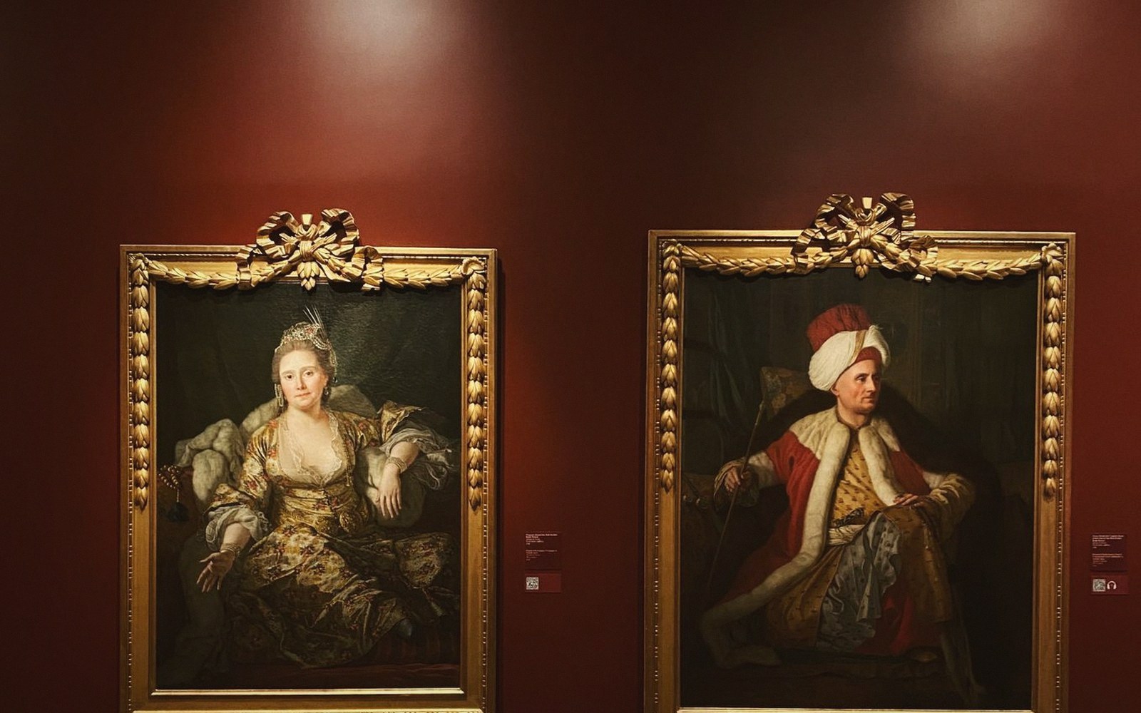
The Colour That Never Left
Most people assume a painting starts white. The canvas is stretched, a white primer goes on, and then the painter builds colour from scratch. That is accurate for many modern works — but for most of Western painting's history, it was not how artists worked at all.
Painters have laid toned, coloured grounds for centuries. They did it for reasons that were partly practical, partly optical, and entirely deliberate. Understanding those reasons changes what you see when you stand in front of a Velázquez, a Rembrandt, or a Rubens.
Why Not White?
A white ground is demanding. Every mark shows against it, including every mistake. More critically, white is the lightest value you can produce on a painting — lighter than any highlight you can mix — so working up from white means every subsequent layer makes the surface darker. The painter must always be fighting upward against the ground's brightness.
A mid-tone ground solves that problem at a stroke. Working on a grey, a warm brown, or an olive green, the painter can push darks and lights away from a neutral centre. Shadows are built down; lights are added on top. The ground does much of the tonal work before a single stroke of final colour is applied.
There is also the question of drying time and coverage. On a white ground, thin or loosely applied paint will sit transparently against bright white — any gap in coverage reads as an error. On a toned ground the same gap simply reads as shadow or mid-tone, blending seamlessly into the surface. Painters could work faster, leave edges unresolved, and still produce coherent form.
The Warm Ground
Across the sixteenth and seventeenth centuries, warm ochre and red-brown grounds were the dominant choice. Spanish and Flemish painters in particular favoured grounds based on red ochre mixed into a lead-white primer — the resulting colour is close to terracotta or dried clay. You can see this in Velázquez's portraits: where the paint is thin, a warm reddish tone shows through, giving the flesh its underlying warmth without the painter mixing it into every stroke. The ground is doing the work; the paint above it is relatively lean.
Rubens used a light grey ground — sometimes described as a pearly grey — which kept his shadows luminous without forcing him to mix luminosity into each shadow glaze separately. His grounds often contained lead white, chalk, and small amounts of earth pigment, adjusted to the specific tonality he wanted for a given picture.
The Grey Ground
Grey grounds — cooler, more neutral — were common in Italian Renaissance practice and persisted through the Baroque. A neutral grey allows both warm and cool colours to read clearly against it, neither boosted nor suppressed by the underlying tone. Painters who wanted precise colour control, without the ground pushing the palette in any particular direction, gravitated toward grey.
The practical route was to mix lead white with black, producing a smooth mid-value grey that accepted oil paint readily. In some Florentine workshop practice, the ground was left close to stone-coloured — a tone derived from the whitish grey of the gesso itself once slightly tinted.
The Green Ground
Perhaps the strangest-sounding choice to modern eyes is the mid-green ground. Yet it was widespread in early Renaissance panel painting. The ground — often called verdaccio (a grey-green made from black, white, and yellow pigments) — was used specifically for flesh. Green sits opposite pink on the colour wheel. Painters would lay their flesh tones as thin glazes above the greenish underlayer, and the two together would resolve into the subtle greyish shadow that skin actually shows. Botticelli's flesh passages in his tempera panels show exactly this: a green underpaint visible in the thin areas, contributing to the cool of the shadowed cheek.
What It Means in the Gallery
When you look at an old painting and notice that the shadows seem to breathe with a warmth or a coolness that the brushwork alone can't explain — you are often looking at the ground. It sits beneath every layer, biasing what rests on top of it. Areas where the paint is thin, worn, or deliberately left loose will reveal it most clearly.
Hold a raking angle of view. Look at the thinnest passages. The brownish warmth you see pushing through a shadow on a seventeenth-century portrait is not dirt, and it is not accident. It is the first decision the painter made.