FRAME — layer 7 of seven
The Picture Starts at the Moulding
A frame is not packaging. It is the first thing a painting says.
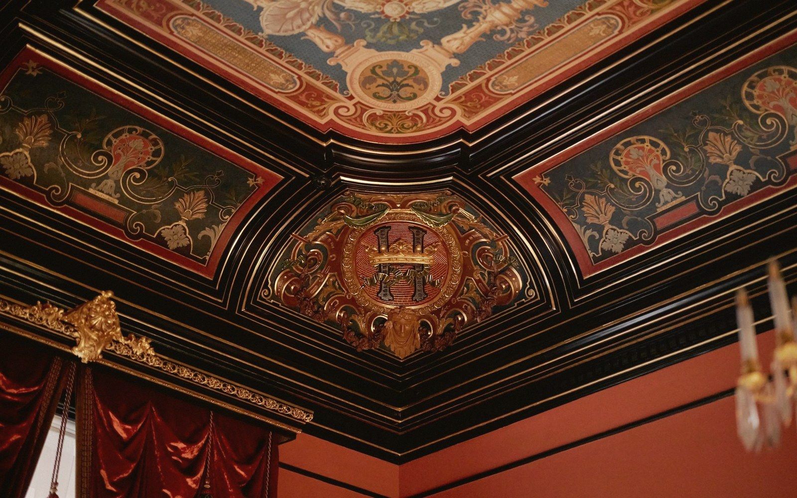
The Edge Is Already a Decision
Walk into any room hung with paintings and notice what happens before you read a single brushstroke. The frame has already told you something — about scale, about formality, about whether this image expects reverence or welcomes you in close. That effect is not accidental, and it is not neutral. Every decision made at the moulding — how wide, how deep, how light or dark — alters what the painting inside feels like.
Start with profile width. A narrow, flat slip of gilded wood sets a painting at a certain conversational distance: contained, precise, a little austere. Widen that profile to four or five inches, build it up with carved acanthus and a stepped rabbet, and the picture becomes an event. The eye registers the frame's mass before it registers the image, so it arrives at the paint already prepared for something significant. Sixteenth- and seventeenth-century altarpieces used exactly this logic. The frame was architecture as much as carpentry — a doorway into a different order of seeing.
Depth works the same way but in a subtler register. A frame with a pronounced inner slope, called a cove or cavetto, funnels the eye inward. The painting appears to sit behind the moulding, recessed into its own light. A flat, flush frame does the opposite: the surface of the canvas seems to press toward you, insisting on itself. Neither is more correct. But they produce categorically different experiences of the same painted area.
Colour and the Altered Interior
Gilding is the most obvious example of colour making an argument. Gold reflects the ambient light of a room and pushes it back into the picture, warming the whole surface. This is not a metaphor — it is physics. The metal bounces long-wavelength light, and the painting seen through that surround appears slightly warmer, slightly more radiant than the same painting in a white or black frame. Venetian painters understood this, and the gilded aedicule frames built for Bellini and Titian were calibrated to that effect. The gold was not decoration; it was part of the tonal system.
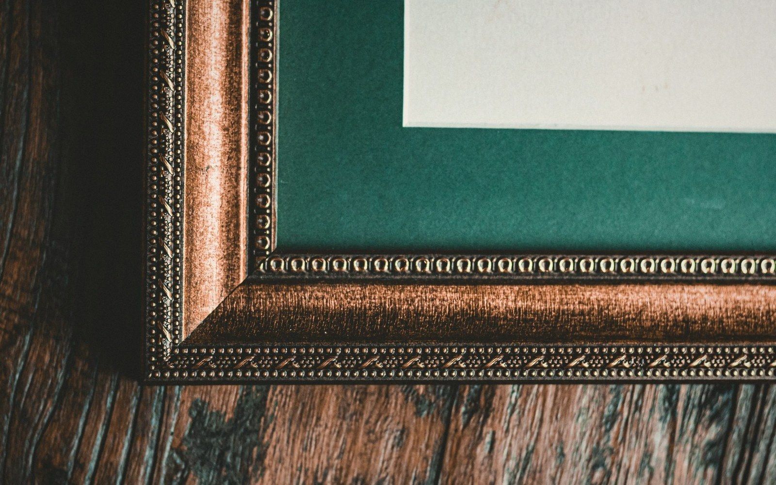
Dark frames make a different kind of argument. A wide, flat-black or ebonised profile isolates the image from the room entirely. There is nothing reflective at the border; the transition from world to picture is abrupt and complete. Dutch cabinet paintings of the seventeenth century were often shown this way — modest in scale, intensely particular, the dark frame functioning almost like the walls of a miniature theatre. The picture's internal light, the gleam on a glass or the white of a tablecloth, becomes more vivid in contrast with that surrounding darkness.
Then there is the toned or coloured frame — ochre, verdigris, red bole left partly exposed through worn gilding — and here the relationship becomes genuinely compositional. When a coloured ground is laid under the paint, an experienced maker may choose a frame that echoes that undertone, so the edge and the interior are in quiet conversation. Whether the original painter controlled this or a later collector made the choice, the result is a unified object: frame and picture as a single visual argument.
What Gets Lost with the Wrong Frame
Swap any of those variables and the painting changes. Not metaphorically — perceptually. A luminous Impressionist panel clamped into a heavy Baroque frame looks trapped, its open handling contradicted by the frame's insistence on ceremony. A delicate silverpoint drawing swamped by a wide gilded surround disappears; the frame outweighs what it holds. Conversely, a large history painting in a thin contemporary slip looks exposed, like a word spoken without punctuation.
Museums make this mistake often enough that it becomes instructive. A painting rehung in a frame from the wrong century — even a period frame, even a beautiful one — loses some of its intended character because the compositional system it belonged to has been broken. The frame a painter intended, or knew, was not an afterthought: it was the room the picture lived in before it ever met a wall.
Looking at any painting well means beginning at the moulding, not despite it. The question to ask is not whether you like the frame. The question is what the frame is doing — what it adds in weight, warmth, or pressure — and whether the picture inside is working with that or against it.